> For the complete documentation index, see [llms.txt](https://gut-analysis-toolbox.gitbook.io/docs/llms.txt). Markdown versions of documentation pages are available by appending `.md` to page URLs; this page is available as [Markdown](https://gut-analysis-toolbox.gitbook.io/docs/4.-analyzing-the-results.md).
# 4. Analyzing the Results
So, you've extracted all that data. Now, how do we deal with those spreadsheets!
To make life easier, we've added some options to merge the spreadsheets in all those folders and subfolders after GAT analysis. To do this, go to `GAT->Analysis`.
Currently, there are two options:
* [**Merge Results**](#merge-results)**:** Merge csv files that match the filename provided across multiple folders.
* [**Merge Results multiple csvs**](#merge-results-multiple-csvs): Merge multiple csvs across different folders.
## What do the files mean?
For example, I've analyzed an enteric neuronal dataset from [*Hamnett 2022 et al.*](https://pubmed.ncbi.nlm.nih.gov/36070775/)*.* The raw data is accessible on [Zenodo](https://zenodo.org/records/7236748). The dataset of interest is a Calbindin, Calretinin and Hu immunolabelled dataset: EXP174 (4 x distal colon (DC) and 4 x proximal colon (PC)).
After analysis, we get 8 folders like this:
├───EXP174 2022\_06\_15 Ca\_DC1
├───EXP174 2022\_06\_15 Ca\_DC2
├───EXP174 2022\_06\_15 Ca\_DC3
├───EXP174 2022\_06\_15 Ca\_DC4
├───EXP174 2022\_06\_15 Ca\_PC1
├───EXP174 2022\_06\_15 Ca\_PC2
├───EXP174 2022\_06\_15 Ca\_PC3
├───EXP174 2022\_06\_15 Ca\_PC4
During analysis, I enter DC1, PC1 etc... to distinguish each replicate and tissue region. This makes downstream analysis easier.
Within a folder, the files are organised like below (`click to expand, and then click on each entry to read a description`):
Example of the files within a folder
│ CalB\_CalR\_ROIs.zip[^1]
│ [ CalB\_ROIs.zip](#user-content-fn-2)[^2]
│ CalR\_ROIs.zip[^3]
│ Cell\_counts.csv[^4]
│ [ Ganglia\_ROIs\_MAX\_EXP174 2022\_06\_1\_PC4.zip](#user-content-fn-5)[^5]
│ [Hu\_label\_MAX\_MAX\_EXP174 2022\_06\_1\_PC4.tif](#user-content-fn-6)[^6]
│ [Hu\_ROIs\_MAX\_EXP174 2022\_06\_1\_PC4.zip](#user-content-fn-7)[^7]
│ [ MAX\_MAX\_EXP174 2022\_06\_1\_PC4.tif](#user-content-fn-8)[^8]
└───spatial\_analysis[^9]
CalB\_around\_CalR.tif[^10]
[ CalB\_around\_Hu.tif](#user-content-fn-11)[^11]
CalB\_coordinates.csv[^12]
CalR\_around\_CalB.tif[^13]
CalR\_around\_Hu.tif[^14]
[ CalR\_coordinates.csv](#user-content-fn-15)[^15]
Hu\_around\_CalB.tif[^16]
Hu\_around\_CalR.tif[^17]
Hu\_coordinates.csv[^18]
Hu\_neighbours.tif[^19]
Neighbour\_count\_CalB\_CalR.csv[^20]
Neighbour\_count\_Hu.csv[^21]
Neighbour\_count\_Hu\_CalB.csv[^22]
Neighbour\_count\_Hu\_CalR.csv[^23]
The names of the file may vary based on analysis and future updates, but the structure should remain the same.
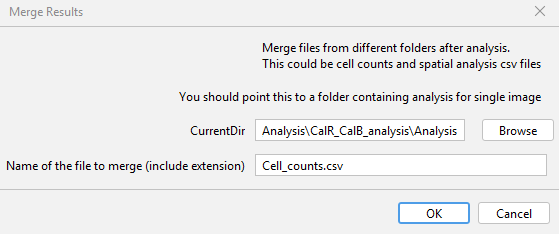
## Merge Results
As you can see, there are multiple `csv` files in every folder. It becomes a challenge to comb through each directory and merge them. If you were interested in the summary of cell counts, you would want to combine all the files with the name: `Cell_counts.csv` as one. To do this, go to `GAT -> Analysis -> Merge Results` as .
Choose the parent directory with all the analysis folders for `CurrentDir`. In the next row, enter the exact name of the file with the extension. As I'm interested in cell counts, I enter `Cell_counts.csv`. After you click ok, it will go through each directory, find the file with matching filename and then merge them into one big file. In this case, the merged file would have the name: `Merged_Analysis_Cell_counts.csv` in the parent directory.
## Merge Results multiple csvs
This is similar to Merge Results, but the difference is it will merge all csv files. It scans the first folder and creates a list of csv files to summarise. It searches for these files across all the subsequent folders and merges them.
```
Merged_Analysis_CalB_coordinates.csv
Merged_Analysis_CalR_coordinates.csv
Merged_Analysis_Cell_counts_CalB_CalRet.csv
Merged_Analysis_Hu_coordinates.csv
Merged_Analysis_Neighbour_count_CalB_CalR.csv
Merged_Analysis_Neighbour_count_Hu.csv
Merged_Analysis_Neighbour_count_Hu_CalB.csv
Merged_Analysis_Neighbour_count_Hu_CalR.csv
```
## Data Analysis
For data analysis, I often use [`Orange`](https://orangedatamining.com/) as its an interactive and freely available software. It uses visual programming, where you drag and drop 'widgets' to create analysis workflows. Its written in Python and has loads of tutorials, both [written](https://orangedatamining.com/docs/) and on [Youtube](https://www.youtube.com/channel/UClKKWBe2SCAEyv7ZNGhIe4g). I will use Orange to demonstrate some of the analysis you could do with the Summary data from above. [Knime ](https://www.knime.com/)is an example of another similar software but with way more options.
[Download ](https://orangedatamining.com/download/)the software and install it on your machine.
Once installed, double click and start a New Project. I won't go into too many details on how the software works. Basically, the widgets on the left are like building blocks of a data analysis workflow. Widgets are grouped into classes according to their function. For more details, I highly recommend the[ introductory tutorials](https://www.youtube.com/playlist?list=PLmNPvQr9Tf-ZSDLwOzxpvY-HrE0yv-8Fy).
### Loading the Data
As the summary data is in csv format, we drag and drop the `CSV File Import` widget onto the canvas
Import CSV widget
Double click on the `CSV File Import` widget and you can choose the file to import. Click on the folder icon to select a csv file.
Import Files
Once opened, you will get an `Import Options` dialog with table and values. If you right click on a column, you can change the type. Column 8 is just a divider, so I've 'Ignored' that column. Otherwise, everything column with strings that can distringuish between experiments or treatments can be set as `Categorical`. You can also set everything to 'Auto' and see if that works too.
| Import Files | Setting Import Options | Changing Column Type |
| :----------------------------------: | :-------------------------------------: | :-------------------------------------: |
|  |  |  |
Once the table is imported, if you want to visualize it, you can click and drag from the `CSV File Import` Widget. If you release the mouse click a list of widgets will appear. Select Data Table. For more info on how to create workflows, look at this [tutorial](https://www.youtube.com/watch?v=HXjnDIgGDuI). Double clicking on the data table will reveal a table corresponding to the data imported.
Data Table Widget
### Creating Classes
Now, we would like to group the data into distal and proximal regions of the colon. To do this, we use the [`Create Class`](https://orangedatamining.com/widget-catalog/transform/createclass/) widget. The column `Experiment` has experiment names, where the suffix `DC` for distal colon and `PC` for proximal colon. We use this information to create classes so data can be analyzed based on each region.
Create Classes
If we connect a `Data Table` widget to the output of `Create Class`, we can see a new column called `Region`.
We can visualize our results by double clicking the Box Plot widget. For example, we can compare the average number of neurons for each region by choosing `Total Hu` as the Variable and `Region` as the `Subgroup`.
Average number of neurons for distal vs proximal colon
Choosing `Experiment` for \`Subgroups\` will show Total Hu per experiment.
### Number of neighbours: Distribution
Example workflow for frequency vs number of neighbours around each neuron (not normalised). Data used: `Merged_Analysis_Neighbour_count_Hu.csv`
Visualizing number of neighbours
[^1]: ROIs for Calbindin and Calretinin double positive neurons
[^2]: ROIs for Calbindin positive neurons
[^3]: ROIs for Calretinin double positive neurons
[^4]: Summary of all cell counts
[^5]: ROIs for ganglia
[^6]: Segmented image for pan-neuronal marker, Hu
[^7]: ROI Manager for pan-neuronal marker, Hu
[^8]: Maximum intensity projection of all channels
[^9]: subfolder with results for spatial analysis if the option is chosen
[^10]: Neighbour map image, where each cell id corresponds to number of Calbindin neighbours around each Calretinin positive neuron
[^11]: Neighbour map image, where each cell id id corresponds to number of Calbindin neighbours each neuron
[^12]: XY coordinates of Calbindin neurons
[^13]: Neighbour map image, where each cell id id corresponds to number of Calretinin neighbours around each Calbindin positive neuron
[^14]: Neighbour map image, where each cell id id corresponds to number of Calretinin neighbours each neuron
[^15]: XY coordinates of Calretinin neurons
[^16]: Neighbour map image, where each cell id id corresponds to number of neurons around each Calbindin neuron
[^17]: Neighbour map image, where each cell id id corresponds to number of neurons around each Calretinin positive neuron
[^18]: XY coordinates of each neuron
[^19]: Neighbour map image, where each cell id id corresponds to number of neuronal neighbours around each neuron (Hu is pan-neuronal)
[^20]: Number of Calbindin neighbours around each Calretinin positive neuron
[^21]: Number of neuronal neighbours around each neuron (Hu +ve)
[^22]: Number of Hu +ve neighbours around each Calbindin positive neuron
[^23]: Number of neuronal neighbours around each Calretinin positive neuron
---
# Agent Instructions
This documentation is published with GitBook. GitBook is the documentation platform designed so that both humans and AI agents can read, navigate, and reason over technical content effectively. Learn more at gitbook.com.
## Querying This Documentation
If you need additional information that is not directly available in this page, you can query the documentation dynamically by asking a question.
Perform an HTTP GET request on the current page URL with the `ask` query parameter:
```
GET https://gut-analysis-toolbox.gitbook.io/docs/4.-analyzing-the-results.md?ask=
```
The question should be specific, self-contained, and written in natural language.
The response will contain a direct answer to the question and relevant excerpts and sources from the documentation.
Use this mechanism when the answer is not explicitly present in the current page, you need clarification or additional context, or you want to retrieve related documentation sections.